圖表英文:30 Essential Chart Phrases for Taiwan Pros (2026)
Knowing your chart English vocabulary means your foreign colleagues understand exactly what a slide is saying in under 30 seconds — no awkward pause, no rereading the numbers. Taiwan professionals in foreign companies, PMs, and marketing managers present Q2 growth, KPIs, and budget variances on Zoom every week, yet many still hesitate over whether to use “increase” vs. “rise,” or “by” vs. “to.” This guide organizes the 30 most useful chart English phrases by presentation flow: opening, describing trends, citing numbers, comparing, emphasizing, and closing.

クリア chart English in 30 seconds beats five minutes of fumbling.
Why Chart English Matters for Taiwan Professionals | 圖表英文
After twenty years teaching ESL, I have watched hundreds of Taiwan learners score near-perfect on grammar tests and clear TOEFL 100 — then freeze on stage when the Q2 numbers go up. The problem is not their English level; it is the absence of practiced set phrases for chart English. Cambridge English Business Vantage examiners consistently flag describing visual data as the single highest-loss item for non-native speakers — a finding that maps directly onto Taiwan office presentations.
The good news: chart English is a closed vocabulary system. There are roughly a dozen core verbs (rise, fall, peak, plateau, fluctuate), four prepositions (by, to, from, at), and specific numbers. Master these 30 sentences and you cover about 90% of business situations. If you are still building your foundation, start with our presentation English phrases guide first, then return to fill in the chart vocabulary.
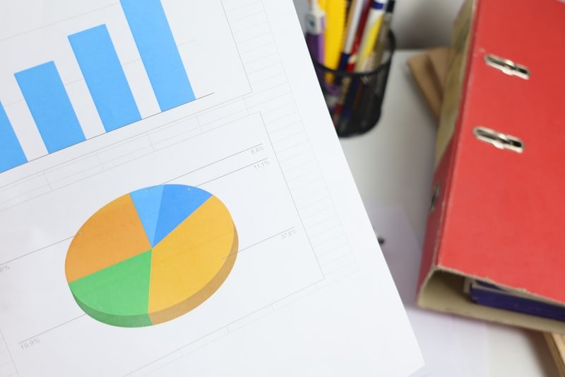
5 Chart Types You Must Know | 圖表英文
Naming the wrong chart type is the most common beginner mistake. Calling a pie chart a “round chart” tells your foreign colleagues you are translating directly from Chinese. Memorize these five types first:
- Bar chart — uses vertical bars to compare categories. Example: “This bar chart compares sales across our four product lines.”
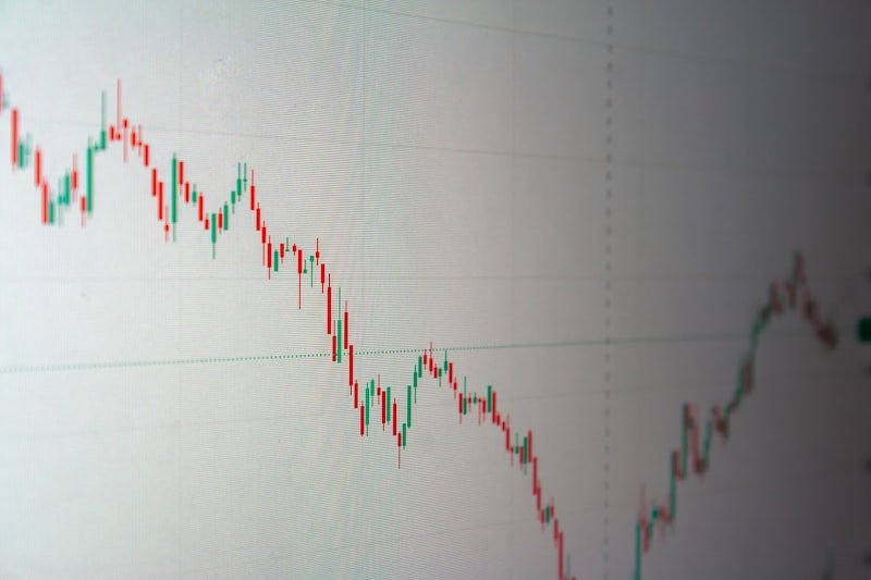
- Line graph — shows trends over time. Example: “The line graph shows monthly revenue from January to December.”
- Pie chart — shows proportional breakdown. Example: “The pie chart breaks down our customer base by region.”
- Table — used for dense number comparisons. Example: “If you look at the table on slide 7, you’ll see the exact figures.”
- Scatter plot — shows correlation between two variables. Example: “This scatter plot shows the relationship between ad spend and conversions.”
The bar chart is the most common chart English type in Taiwan quarterly business reviews.
5 Phrases to Introduce a Chart | 開場英文
When you open a new slide, give your audience two seconds to focus before you start talking — that is the job of an opening phrase. Use any of these five and you will never go wrong:
- “As you can see from this chart…” — The universal opener that works in every context.
- “This chart shows / illustrates / displays our Q2 revenue.” — Rotate show / illustrate / display across slides to avoid repetition.
- “Let me draw your attention to the figures on the left.” — Foreign colleagues appreciate this kind of guiding language.
- “I’d like to highlight one key data point on this slide.” — Signals you will not read every number aloud, which is smart chart English delivery.
- “If we look at the horizontal axis, it represents the months of 2026.” — Remember: horizontal axis = X-axis, vertical axis = Y-axis.
Describing Trends: 10 Verbs and Adjectives | 趨勢英文
Trend vocabulary is the core of the entire chart English system — and the area where Taiwan presenters most often go wrong. The key principle: the verb describes direction, the adverb describes intensity. “Rose sharply” carries twice the information of “rose” alone.

For strong trend English, pair a verb with an adverb to show both direction and speed.
Upward verbs: rise (neutral), increase (neutral), climb (steady), soar (sharp), skyrocket (explosive). Downward verbs: fall, decrease, decline (gradual), 落とす (sharp), plummet (severe).
- “Revenue rose sharply in March.” — sharp/sharply is the most common intensity adverb in business presentations.
- “Sales declined gradually over Q2.” — gradual sounds far more professional than slow.
- “The stock price plummeted after the announcement.” — use plummet for drops of 20% or more.
- “Traffic fluctuated throughout the quarter.” — fluctuate means up-and-down volatility, not a simple decline.
- “Conversions peaked at 8.2% in May.” — peak as a verb is more concise than “reach the highest point.”
- “User growth plateaued in Q1.” — plateau means flat with no movement; standard in tech and startup presentations.
- “The line dipped slightly in February before recovering.” — dip signals a short-term drop that bounces back; pair it with recover.
- “Membership has remained stable since January.” — remain stable is more formal than “stay the same.”
Saying Numbers Like a Pro | 英文數字
Taiwan presenters make three consistent mistakes with English numbers: choosing the wrong preposition for percentages, reading large numbers incorrectly, and mispronouncing decimals. Lock in these three rules before moving to the examples below:
When citing English numbers, by = the change amount; to = the ending value. Do not mix them up.
Rule 1: Use by for the amount of change, に for the final value. Example: “Sales rose by 12%, に NT$48 million.” Rule 2: Read thousands as thousand, millions as million — note that one hundred million is the correct English equivalent, not one billion. Rule 3: The decimal 0.5 is “point five,” never “dot five.”
For more detail on business money vocabulary — salary, budget, profit — see our 25 business money collocations guide.
- “Revenue increased by 15%, from NT$40M to NT$46M.” — Classic by/to structure; use the template from Rule 1 above.
- “Our market share grew threefold in three years.” — threefold is more professional than “three times.”
- “That’s roughly one in five customers.” — converting raw numbers to ratios makes data instantly relatable.
- “The figure stands at approximately 2.4 million.” — stand at means the current value is; use it instead of “is currently.”
Comparing Data: Year-on-Year and Quarter-on-Quarter | 比較英文
Almost every business chart compares something — same period last year, the previous quarter, or a target. Memorize two abbreviations: YoY (year-on-year) and QoQ (quarter-on-quarter), and you are already ahead of half your Taiwan colleagues on the call.
- “Revenue is up 18% year-on-year.” — American English also uses year-over-year; both are correct.
- “That’s a 5-point improvement compared to Q1.” — Note: 5 percentage points = 5 points in English, not 5%.
- “Performance was in line with our forecast.” — in line with sounds more polished than “same as.”
- “This figure significantly outperformed last year’s results.” — outperform is one of the highest-frequency verbs in English business presentations.
- “In contrast, the European market shrank by 3%.” — in contrast is the standard pivot signal when you flip to opposing data.

YoY and QoQ are standard shorthand in every international business presentation.
3 Phrases to Highlight Key Points | 圖表英文強調語
Every chart has one or two numbers that really matter — the rest is background noise. Use these three phrases to tell your audience exactly when to pay attention:
- “The most striking feature is the spike in April.” — striking is more precise than “important” when you want to flag a surprising spike.
- “What stands out is the gap between Q2 and Q3.” — stand out is idiomatic and immediately clear to native English speakers.
- “It’s worth pointing out that the trend reversed in May.” — using reverse precisely here elevates your entire delivery.
Wrapping Up Your Chart: 2 Closing Phrases | 圖表英文收尾
After walking through the numbers, do not leave the takeaway for your audience to figure out. Give them one clear sentence that states what the chart means:
- “Overall, the chart suggests that our Asia strategy is paying off.” — suggest is more objective than prove and leaves room for discussion.
- “In summary, three out of five regions are now growing above 10%.” — in summary is the safest closing phrase for international business settings.
Closing a chart clearly means telling the story behind the numbers, not just reading them.
4 Common Chart English Mistakes Taiwan Learners Make | 圖表英文地雷
After running hundreds of business English presentation workshops, I have identified the four mistakes that come up most often. Fix these and your English immediately sounds like someone with international business experience:
- Using “raised” to describe sales: raise is something a person does intentionally. Sales move on their own — use rose or increased. Correct: “Sales rose.” Wrong: “Sales raised.”
- Dropping by before a percentage: “grew 12%” is incomplete in formal English. You need the preposition: “grew by 12%.”
- Saying “single growth” instead of “single-digit growth”: the correct terms are single-digit growth vs. double-digit growth. Taiwan executives use these constantly in English meetings.
- Directly translating chart type names: a common one is calling a bar chart a “long bar chart.” The correct term is simply bar chart (or vertical bar chart when needed, though it is rarely necessary).
If your job involves regular English video calls, also check our video conferencing English phrases to round out your before-and-after meeting vocabulary.
Practice Drill: Walk Through a Chart in 60 Seconds | 圖表英文演練
Here is a sample script you can adapt by swapping in your own product name, months, and numbers. Read it aloud once and you will immediately feel the structure click:
“Good morning, everyone. As you can see from this line graph, this is our monthly active user count from January to June 2026. The vertical axis represents users in thousands; the horizontal axis represents the months. Let me draw your attention to two key trends. First, users rose sharply by 23% between February and April, reaching a peak of 84,000 in April. Second, growth plateaued in May before dipping slightly to 81,000 in June. In summary, the chart suggests our Q1 marketing campaign worked, but momentum slowed once it ended. Any questions?”
That runs about 60 seconds — exactly the standard time per slide in international presentations. Memorize it, adapt it to your data, and you have a reusable chart English template ready for any meeting.

Drilling one sample script and adapting it to your data is faster than searching for phrases mid-presentation.
Real Taiwan Office Scenarios for 圖表英文
Knowing the phrases is one thing; knowing where they show up in your week is another. Here are four moments in a typical Taiwan office where solid chart English separates the manager from the staff:
Quarterly Business Review (QBR): Your APAC director flies in from Singapore and wants a 15-minute summary of the past quarter. You will need to introduce three to five charts, describe the main trend on each, and answer follow-up questions about specific data points. The hardest part is pivoting from a planned script to a spontaneous response when the director asks, “What drove the spike in week 7?” Practice answering with a single sentence: “The spike in week 7 was driven by our Mother’s Day campaign, which generated 18% of total Q2 traffic.”
Weekly Marketing Stand-up on Zoom: A 20-minute call with team members in Manila, Bangkok, and Sydney. You typically share one dashboard and walk through three KPIs. Open with the headline: “Conversion is up four points week-over-week to 6.8%, mostly from the Tainan store launch.” Then drill into the chart only if someone asks a follow-up. Short, headline-first delivery wins international meetings every time.
Investor or Board Update: If you work in a startup or a publicly listed Taiwan company, the stakes are higher. Stick to neutral verbs (rose, grew, declined) and avoid emotional language (skyrocketed, collapsed). Investors hate drama in charts. The cleanest opening: “Revenue for the quarter came in at NT$72 million, an 11% increase year-on-year and 3% above our internal forecast.”
Client Pitch with External Buyers: Here you are using chart English to build trust, not just transfer information. Slow down on the key chart, name the implication, then pause for two seconds before the next slide. Silence after a strong data point is a power move most Taiwan presenters skip.
Quick-Reference Sentence Templates You Can Reuse
The fastest way to sound fluent is to memorize templates with one blank to fill. Below are seven plug-and-play sentence templates that cover most situations. Practice them out loud until the blanks come automatically:
- Introduction: “This chart shows [METRIC] for [TIME PERIOD].”
Example: “This chart shows monthly revenue for the first half of 2026.” - Headline trend: “Overall, [METRIC] [VERB] [AMOUNT] from [START] to [END].”
Example: “Overall, sales rose 23% from January to June.” - Peak or low point: “[METRIC] peaked at [VALUE] in [TIME], and bottomed out at [VALUE] in [TIME].”
Example: “Sign-ups peaked at 12,400 in April and bottomed out at 4,100 in November.” - Year-on-year comparison: “Compared to the same period last year, [METRIC] is [UP/DOWN] [AMOUNT].”
Example: “Compared to the same period last year, churn is down two percentage points.” - Explaining a spike: “The increase in [TIME] was driven by [REASON], which contributed [AMOUNT].”
Example: “The increase in May was driven by our influencer campaign, which contributed 31% of new signups.” - Forecast or projection: “Based on this trend, we expect [METRIC] to reach [VALUE] by [TIME].”
Example: “Based on this trend, we expect monthly active users to reach 120,000 by Q4.” - Closing the chart: “The takeaway from this slide is [ONE SENTENCE INSIGHT].”
Example: “The takeaway from this slide is that our paid channels are scaling faster than organic, which has implications for next quarter’s budget.”
Print these seven templates, stick them next to your monitor, and use them in your next three internal meetings. Within two weeks you will not need to read them. That is how chart English becomes muscle memory rather than a script you panic-search for mid-presentation.
Business English Chart Vocabulary Video | 影片教學
This To Fluency video covers the core verbs and future-prediction phrases that complement this article perfectly. Hearing a native speaker’s pacing and rhythm is something no written guide can fully replace:
Next Step: Turn These 30 Phrases into Muscle Memory | 圖表英文
Reading without practicing is the same as not reading at all. Tonight, take a recent presentation, pick three slides with charts, and walk through each one in English in under 60 seconds. Record yourself, listen back, edit, record again. Do that for one week, and the next time a foreign manager asks “Could you walk me through this chart?” your mouth will move faster than your brain.

Find one colleague to be your audience — that beats ten YouTube videos for building real chart English fluency.
Frequently Asked Questions About 圖表英文
Is “graph” the same as “chart” in business English? In casual conversation they are interchangeable, but in formal reports a graph usually refers to a line graph specifically, while chart is the umbrella term. When in doubt, say chart and you will not sound wrong.
Should I read every number on the slide out loud? No. Pick the two or three numbers that matter, name them clearly, and let the rest stay on screen for the audience to scan. Reading every number sounds like a robot and burns your speaking time.
How do I handle a question I do not understand? Use this safe phrase: “Just to make sure I understood your question correctly — you are asking about the Q2 dip, is that right?” This buys you four seconds to think and signals respect.
情報源
- Cambridge English Business Vantage (BEC) — Exam information and speaking band descriptors
- British Council — Talking About Numbers and Statistics in English
- Cambridge Dictionary — Vocabulary topic: charts and graphs
- Coursera — Business English Vocabulary Guide for Professionals
Looking for free ESL worksheets for your classroom? Browse our free worksheet library →
Are you a teacher? Find lesson resources and worksheets at TahricTeaches.com.
Shop on Amazon
English Learning Books on Amazon →
As an Amazon Associate we earn from qualifying purchases.